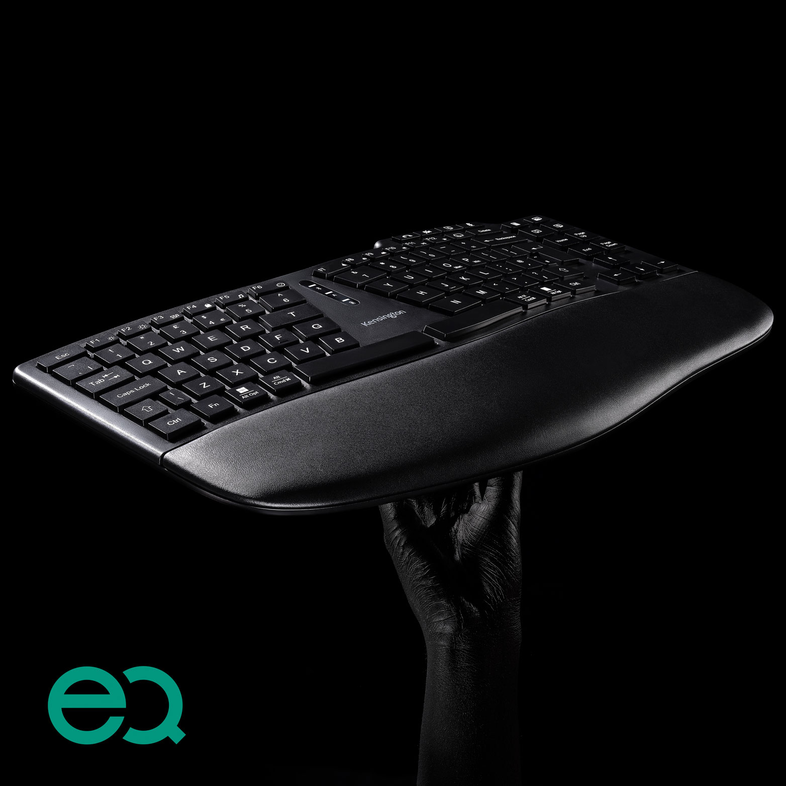
Kensington EQ
Designed Using More Sustainable Materials

Designed Using More Sustainable Materials


Motion gives the brand a fresh and lively look and feel. It adds interest and gives products a world to live in. Follow these key components and their guidelines to build strong Kensington visuals.


• Educated
• Energetic
• Helpful
• Modern
• Professional
• Innovative
• Global Marketing or approved vendor creates the first draft of script or storyboard.
• GPM and RPM review and comment/approve before shooting (optional if this is a regional marketing effort).


• 1080p Apple Pro Res HQ is the final deliverable requested - other formats can be extracted from this.
• Max. 20 sec - more aim for 10-15 sec.
• 1080P H264 (target bitrate e.g. 10mbit) is the final deliverable requested.
• File size if possible should not be higher than 20 MB.


• Full length: 1–3 minutes. Average video or animation is 60–90 seconds. Can break up longer (3+ min) videos into shorter clips.
• Social media: 15 seconds (this will allow for the video to be used as a “bumper” ad on YouTube).
• Always film horizontally (landscape).
• At least 1080P — the higher, the better.
• Bright, even lighting.
• Modern, contemporary, bright office environment.
• Straight cords.
• No office or desk clutter.
• Products and surfaces clean.
• 1080P MP4 is the final deliverable requested.
• Final file size to be less than 100MB.
Full rights to use:
• Purchased on Getty, or model release if we take the photo.
• No other brand names present.
• All product images used must be final.
For lifestyle videos, there should be a story with a beginning and an end. The Kensington brand always needs to be represented in a business professional format (whether office or vertical setting such as education or healthcare). All of the information in the video or animation needs to be the features/benefits as we know them to be true. Animations should not aim to cover all main features - only the most important points (five maximum). All aspects of the video or animation should follow the tone of the Kensington brand guidelines.
• Recommended video dimension is 1280 x 720 for Landscape and Portrait.
• Minimum width is 600 pixels (length depends on aspect ratio) for Landscape and Portrait.
• Landscape aspect ratio is 16:9.
• Portrait aspect ratio is 9:16 (if video includes link, aspect ratio is 16:9).
• Mobile renders both video types to aspect ratio 2:3.
• Max file size is 4GB.
• Recommended video formats are .MP4 and .MOV.
• Video length max is 15 seconds for advertisements (this will allow for the video to be used as a “bumper” ad on YouTube).
• Video length can be longer if not being used as an advertisement.
• Video max frames 30fps.
Youtube
• A standard landscape aspect ratio is 16:9.
• Many users watch YouTube on their TV screens now. 2160p: 3840x2160 is nice to have.
• For YouTube Shorts – it can be a square 1:1 or vertical 9:16 aspect ratio.
• The maximum length for Shorts is 60 seconds.
• Shorts are optional.
Meta (Facebook & Instagram)
• Stories and Reels should be a 9:16 aspect ratio.
• Standard posts should be a 1:1 aspect ratio.
These guidelines are for anyone building Kensington marketing assets, so that we can ensure brand consistency and maintain a strong brand across all properties. Please email any issues to Kensington Global Marketing: