Kensington EQ

Kensington EQ

Designed Using More Sustainable Materials
Learn More

Skip to Content Skip to footer
To see content specific to your location, return to the country or region that matches your location.

Suggestions

  • No Suggestions

Site Pages

Man workin from a coffee shop using kensington products.

Photography

On this page, you will find guidelines, rules, and advice to help photography represent Kensington in the best possible way.

Collage of Kensington Imagery.

Product Shots and Renderings

 
Kensington products with callouts.
StudioDock on white background.

Lighting and shadows

This applies to renderings as well as to photography.

  • Images should have a natural soft shadow. Avoid shadows on or behind products hanging in the air, as well as using Photoshop drop shadows. If photographers create shadows, they should always provide a Master TIFF file that allows the shadows to be removed.
  • The products should have a clean look, emphasizing the surface and showcasing the materials and high quality. Cables should be hidden or faded out when possible.
  • To give a product "atmosphere", it may be placed on the Kensington Light Gray background during asset creation.
  • For hero shots, place the product on a white seamless background. The background atmosphere and shadow should be removed in the Master TIFF file (see result in hero shots).
TIFF Photoshop interface.

Master TIFF

Hero shots need to be provided with a shadow and white background on seperate layers.

  • Product needs to be on a transparent layer and include an outline clipping path. But must be at 0.2px device flatness and named with Path 1 (nothing else).
  • Drop shadows should be on their own layer with the blend mode set to ‘multiply’.
  • Tiff files should include as separate layers: 1. Product on top layer with mask or transparent background; 2. Shadow layer; 3. White background
  • Master mask can be placed in the Tiff file to check the right proportions and safe space around the product.

Image Delivery Specifications


TIFF

• Dimensions (pixels): 6000px x 4000px (horizontal product); 4000px x 4000px (vertical product)

• Resolution: 300dpi (for web it will be downsized to 72dpi by Kensington)

• Color Space: RGB (designer will convert to CMYK for print)

• Clipping Path: Single clipping path at 0.2px device flatness named Path 1 (not Path1, Path_1, or left as ‘Working Path’)

• Format: Layered .tiff with LZW compression

JPEG

• Dimensions (pixels): 2560px x 1707px (approx)

• Dimensions (inches): 35.5” x 23.7” (approx)

• Resolution: 72dpi

• Color Space: RGB

PNG with transparent background

• Dimensions (pixels): 2560px x 1707px (approx)

• Dimensions (inches): 35.5” x 23.7” (approx)

• Resolution: 72dpi

• Color Space: RGB

Mask for product shots example.

Mask for product shots

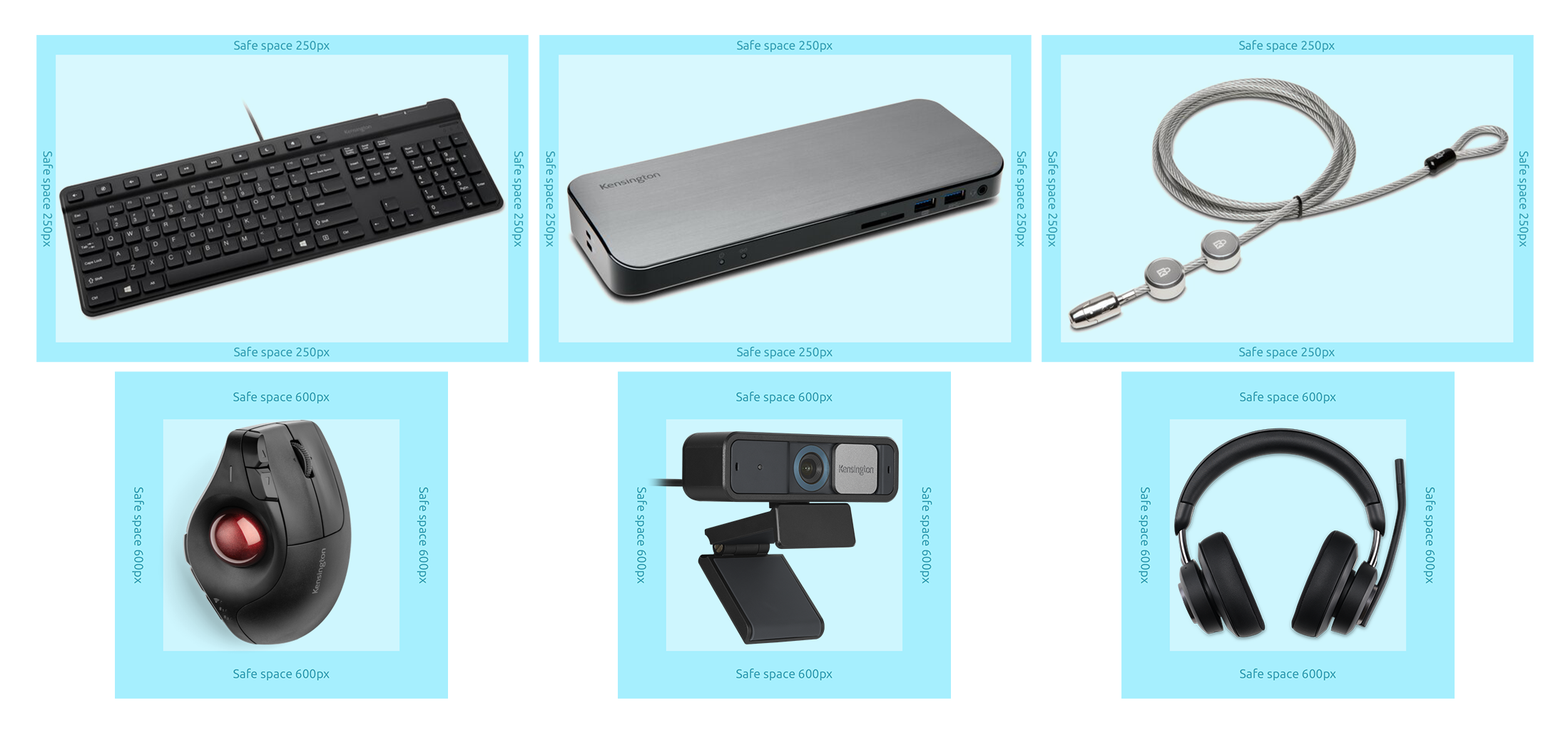
To ensure a uniform presentation of the products across the board, protective space must be maintained for all products.

In this files, you will find the horizontal and vetical master mask. Once opening it in photoshop you can place in your TIFF file to use as guidance. Once opening it in photoshop you can place in your TIFF file to use as guidance.

  • File size: 6000 x 4000 px; 4000px x 4000px
  • The safe space around every product is 250px to 600px
Don’ts for product sizes examples.

Use the same dimensions of the same product category.

Hero shots example.

Hero shots

For hero shots, find the angle that most clearly define the product and that has a visual impact. This is usually front, top or a horizontal 45° angle to the camera. The height can also vary by product.

  • The entire product should be seen: no part of the subject should be cropped out unless there is a cable attached to the product (e.g. a trackball or mouse with cable).
  • If the product is a category image, then the hero image should match the composition of the other category hero shots. Please use your best judgement here.
  • When products are placed in direct comparison, keep approximate proportions the same and provide enough clear space around each product.

Standard camera perspectives

The camera angles are determined by the product manager or shot list provider. Please use these descriptions in the file name when submitting.

In-use- wide angle

Detail- macro angle

Side 2- 90° angle

Scale- varies

Side 2- horizontal 45° angle

Kensington mouse seen from the top down angle.

Top down- straight on top view of the product (used for hero shots)

Kensington StudioDock seen from a front angle.

Front- Eye level/ slightly above (used for hero shots)

Kensington StudioDock seen from an angled view.

Angled shot- High angle 45° camera angle (used for hero shots)

Kensington StudioDock seen from a rear angle.

Rear- slightly above

Kensington StudioDock seen from a side angle.

Side shot - slightly above

Kensington StudioDock seen from a bottom or back side angle.

Bottom or backside - Topdown or eye level shot

Product angles examples.

Product angles

Every product category has its individual product angle, considering the various shapes. To be consistent within the categories, please follow the given examples.

  • The examples in each of these categories should be used as a template for the correct product angle.
  • Try to align the top edge/perspective line to the examples as well.
Wrong product angle and perspective shot.

Stick with the correct product angle and perspective for each product category.

What’s in the box (WITB) - Components shots

Images show what comes in the box with the purchase of the product. These types of shots can be used for catalogs and web.

SD7000 Docking Station on white background.

Create a balanced composition with all elements well illuminated. All components should be positioned in the same angle.

LD4650P USB-C Docking Station on white background.

Shoot the product with all cables and power adapters that are included. Don’t include the instruction manual.

SD3500v Docking Station on white background.

If there are European (EU) and Asia-Pacific (AP) adapters, then additional shots are needed.

Kensington products with accessories collage.

Products with accessories

In use shots should show how the product works and should not have people in them. These types of shots can be used for ads, catalogs, web, and trade show banners.

  • Illuminate any LED lights or drop in screens/backgrounds in Photoshop if the product has a screen. Screens on devices should always have a screensaver.
  • Any devices that show the usage of the product should be plugged in.
  • Include cables if they are part of the product (wired product vs. wireless). Cables should be positioned to create as little visual distraction as possible.
  • The background environment should be simple and not compete with the product for visual attention.
Closer look to kensington products and detailed shots collage.

Detail shots

  • Make sure the entire product is sharp (wide depth of field and focus stacking if needed, for infinite focus range).
  • Pay extra attention to appealing and harmonious lighting, in addition to natural soft shadows, to emphasize the premium materials and finish of the product.
  • Wisely select the shot composition, angle, and crop, in order to highlight and isolate the product attribute and specific design points of interest.
  • Playing with negative space and dynamic lines helps to highlight the details while making the product look sturdy.
  • Highlight key features or interesting hidden details.

Environment and Lifestyle Shots

 
Environment and Lifestyle Shots.
Woman in a meeting using a StudioDock.

Lifestyle

The aim is to capture the product being used in real-life events. Lifestyle shots typically involve models interacting with the product.

  • Ideally, viewers should be able to see themselves utilizing the product in the scene. When using models, effort should be made to ensure that diversity of race and ethnicity is represented and that the scene reflects an authentic moment of life using our products.
  • The image should quickly communicate a story about the product’s function.
  • In order to help the viewer relate and connect to the scene, the shots involving models should be considered from an human-scaled eye-level. Top-downs, eye-bird views, or super low-angle shots are to be reserved for shots without models, as they would break from a natural human eye-level perspective.
Woman holding her phone shot and, desktop computer with kensington background-image.

Screen mockups

When a person is in the shot, use screen mockups that visually tell the story of what that person is doing using the products. If there is no person included, please use one of the screensaver mockups.

  • Use these mockups for your shots to help achieve the most accurate perspective.
  • Try to arrange your lighting so that the screen doesn’t have extreme reflections.
  • If inserting the mockups in post-production, consider adding natural reflections and lighting to showcase the mockups as realistically as possible.
  • Certain OEM products are uniquely identified by specific screensavers. Make sure to use the appropriate screensaver if you choose to use a product-specific one vs. a generic one.
Well dressed people talking on their phone and headsets.

People and clothing

Models should look modern and relevant.

  • Diversity: Always consider models from all ethnicities.
  • Attitude: Thoughtful, natural, spontaneous and aspirational.
  • Clothing should be modern while still feeling classic and timeless, rather than following a trend.
  • Models should wear solid, simple colors with clean lines. No clothing with distracting patterns, wrinkles, frills, or stylistic elements that would detract from the product.
StudioDock holding a tablet, charging a mobile phone and in-ear headphones on desk.

Environmental and desk setups

Environmental shots typically involve one product in a scene, such as a home or office setup, or an ecosystem of products to convey a solution. Models may be in the shot, but they wouldn’t interact with the product.

  • The surroundings should work as a stage and not distract from the product.
  • The scenography should be minimal yet natural; telling a consistent plausible, and authentic story.
  • Cables should be nicely arranged and/or hidden if possible.
Home desk decorated with plants, warm light and kensington products and woman working in an office with white light and formal atmosphere.

Home office versus office

In home office scenarios, emphasize a warm and cozy home-like feeling with warm lighting and home-related props such as pillows, a coffee cup, plants, pictures, and custom items on the desk. For office spaces, use a more structured, serious look, with colder lighting (yet friendly, spacious, clean, and welcoming).

StudioDock and kensington products on desk with a white background.

Image crop, angle, and clear space

To ensure that an image can be properly incorporated into a layout (with or without text), make sure there is enough clear space on all sides around the product, while maintaining the product as the center of attention.

  • Images that can be easily extended by color or edits in Photoshop are very helpful.
  • Eliminate distractions in the background by using selective focus, or by lightening or darkening areas of the image in Photoshop.
  • Use a gentle contrast between the product and its surrounding.
StudioCaddy holding a tablet, laptop, mobile phone and in-ear headphones on desk with decorative plants in the back.

Tones

The colors create a vivid atmosphere. We set ourselves apart by using reduced colors and desaturated hues instead of color-intensive tones. Thereby, we create harmony and elegance throughout the images, reflecting an easy-going manner.

  • Try to incorporate a light and airy or dark and elegant aesthetic with focus on simplicity and functionality.
  • Create an almost monochromatic color balance with a few darker pieces, that are not too distracting.
  • Vibrant on-screen colors can be used to draw attention to the product. Choose the screensaver according to its purpose.

Light Mood Pictures


Dark Mood Pictures


Don'ts for Product Angles

 
Almost invisible kensington mouse inside a jar with scissors, pencil and on a black notebook.

Try to avoid unflattering angles or placements to the product.

Heavily retouched security selector backgorund.

Try not to use heavily retouched looking imagery.

Security lock plugged into a laptop almost invisible because of the image alignment.

Try to keep our products as center of interest.

Woman using a Kensington charging station with a cluttered environment.

Try to avoid unflattering colors (yellowish, dirty looking walls) in backgrounds and cluttered environments.

Cluttered image of a man working at the office.

Try not to use heavily cluttered images rather work with focal length and less distracting environments.

Security lock plugged into a laptop almost invisible because of the image alignment and blur.

Try to make the screens look fresh and vibrant.

Campaigns and Special Shots

Colorful and creative collage with different docking satations.

Campaigns

Products that are highlighted in a campaign can be presented in a more creative and abstract way while maintaining simplicity and a premium feeling.

  • Use clean backgrounds. They can be colored but should not take away the main focus of the image. Preferably use colors from the Kensington color scheme.
  • Present the product in an interesting or even playful way, using lots of space around the object.
  • Use realistic shadows and avoid Photoshopped-looking drop shadows.
  • If using additional props, make sure they do not distract from the product.
  • If a seasonal theme, appropriate background colors and objects may be added.

Social Media Mood Board (Dark)

Social Media Mood Board (Light)

Collage with authentic look and feel and fits the brand style.

Stock imagery

If stock imagery is needed, use imagery that has an authentic look and feel and fits the brand style.

  • Prioritize images representing authentic people in natural moments of life. Avoid studio shots, artificial renderings, collages, or exaggerated scenographies.
  • If images are needed for other categories (e.g. fitness) use lifestyle images, product arrangements (link) or iconography (link) to communicate the message.

Note: Please try to use Getty image account where possible.

Vibrant stock imagery collage showing the brand style and authentic looks.

Do's for Campaigns and Special Shots


Lifestyle photography and product combinations

In the case of visualizing the combination of photography and products these are two options to go with:

  • Option 01: Use icons to add to the photography. If using mid render icons, a 1px circle around the icon can be added.
  • Option 02: If icons are not available, use a circular background for the products and arrange in a clean way.
Woman practicing yoga showing the ergo that kensington products offer.

Don'ts for Campaigns and Special Shots

 
Image with unflattering angles to the product.

Try to avoid unflattering angles or placements to the product.

Heavily retouched image lots of colors and filters.

Try not to use heavily retouched looking imagery.

Kensington products aligned to other sides but not to the center.

Try to keep our products as center of interest.

Woman wearing unflattering colors and dirty looking walls.

Try to avoid unflattering colors (yellowish, dirty looking walls) in backgrounds and cluttered environments.

Cluttered images showing a woman more than kensington products.

Try not to use heavily cluttered images rather work with focal length and less distracting environments.

Darkblue image with a black background with GDPR badge.

Try to make the screens look fresh and vibrant.

Kensington Brand Center

These guidelines are for anyone building Kensington marketing assets, so that we can ensure brand consistency and maintain a strong brand across all properties. Please email any issues to Kensington Global Marketing:

globalmarketing@kensington.com